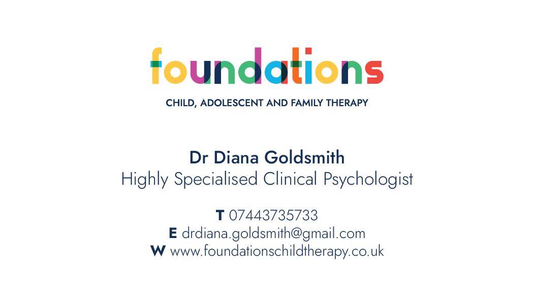
The font used in the logo is Gilbert Colour and Gilbert, a fun and beautiful font created by Hayato Yamasaki, Kazunori Shiina, and Robyn Makinson.
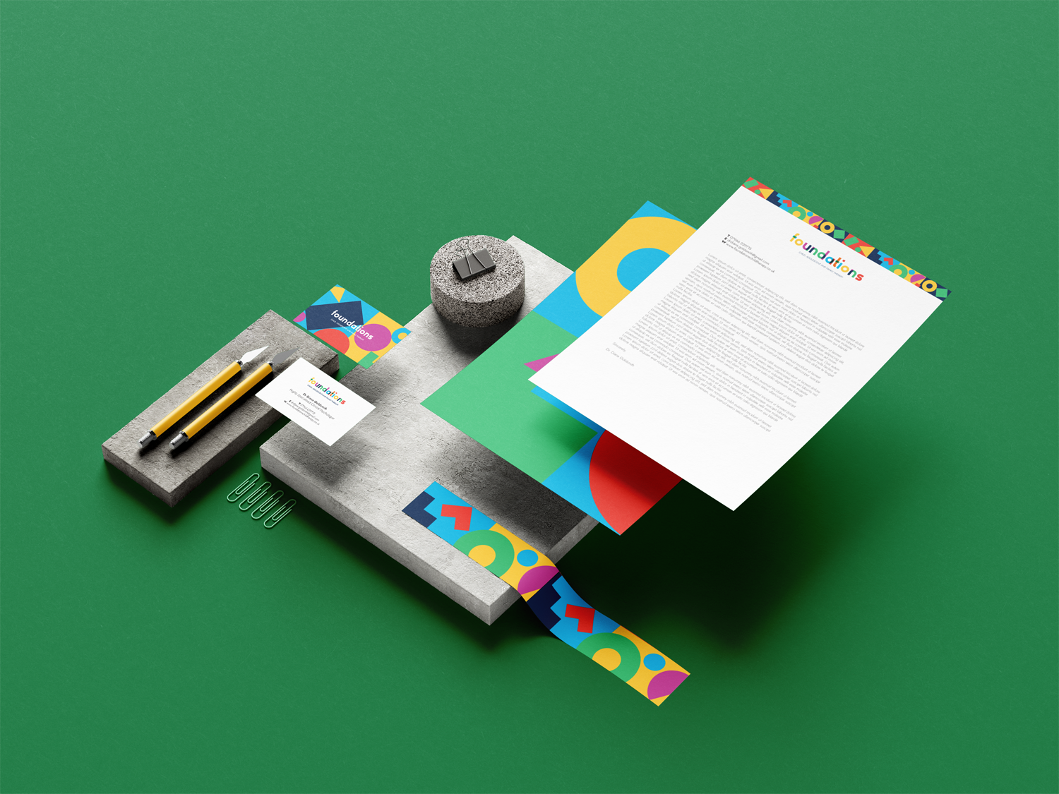
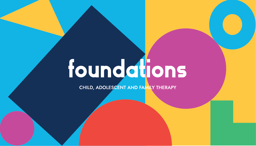
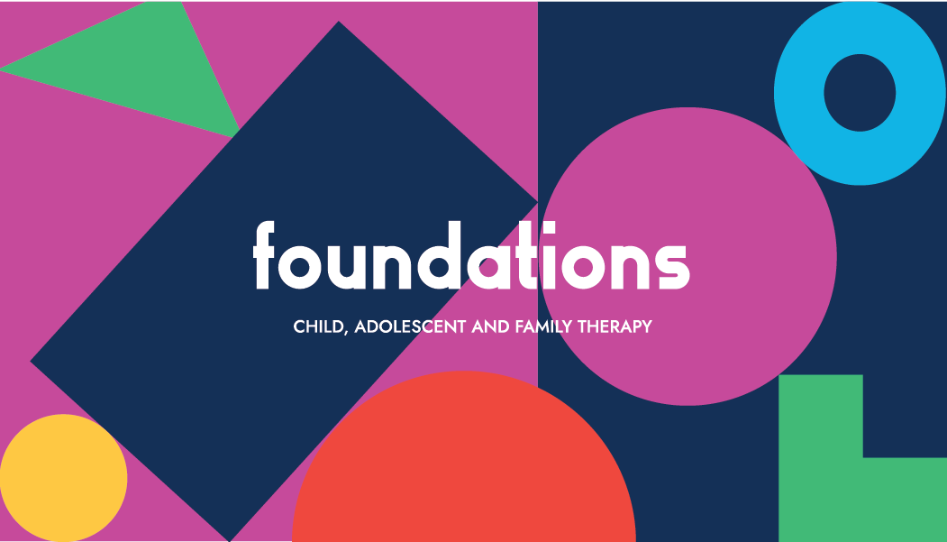
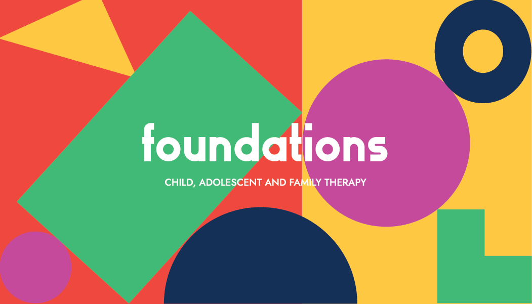
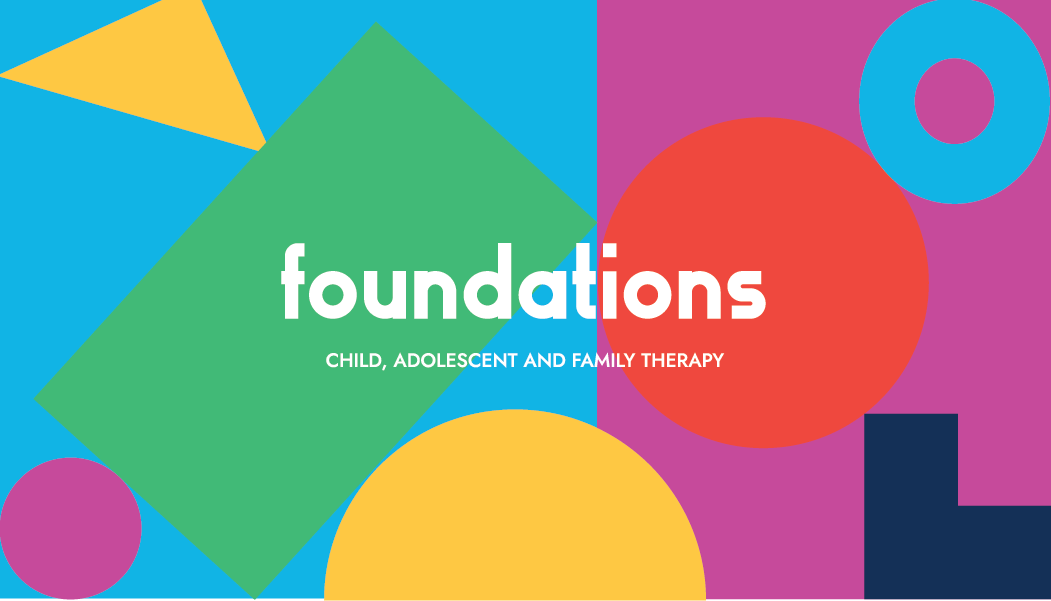
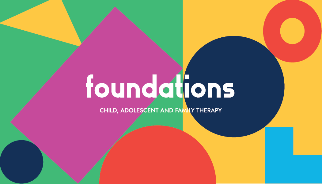
The modular branding style allowed me to create multiple business card variations that kept things fun and interesting for the brand while keeping it all cohesive with consistent colours.
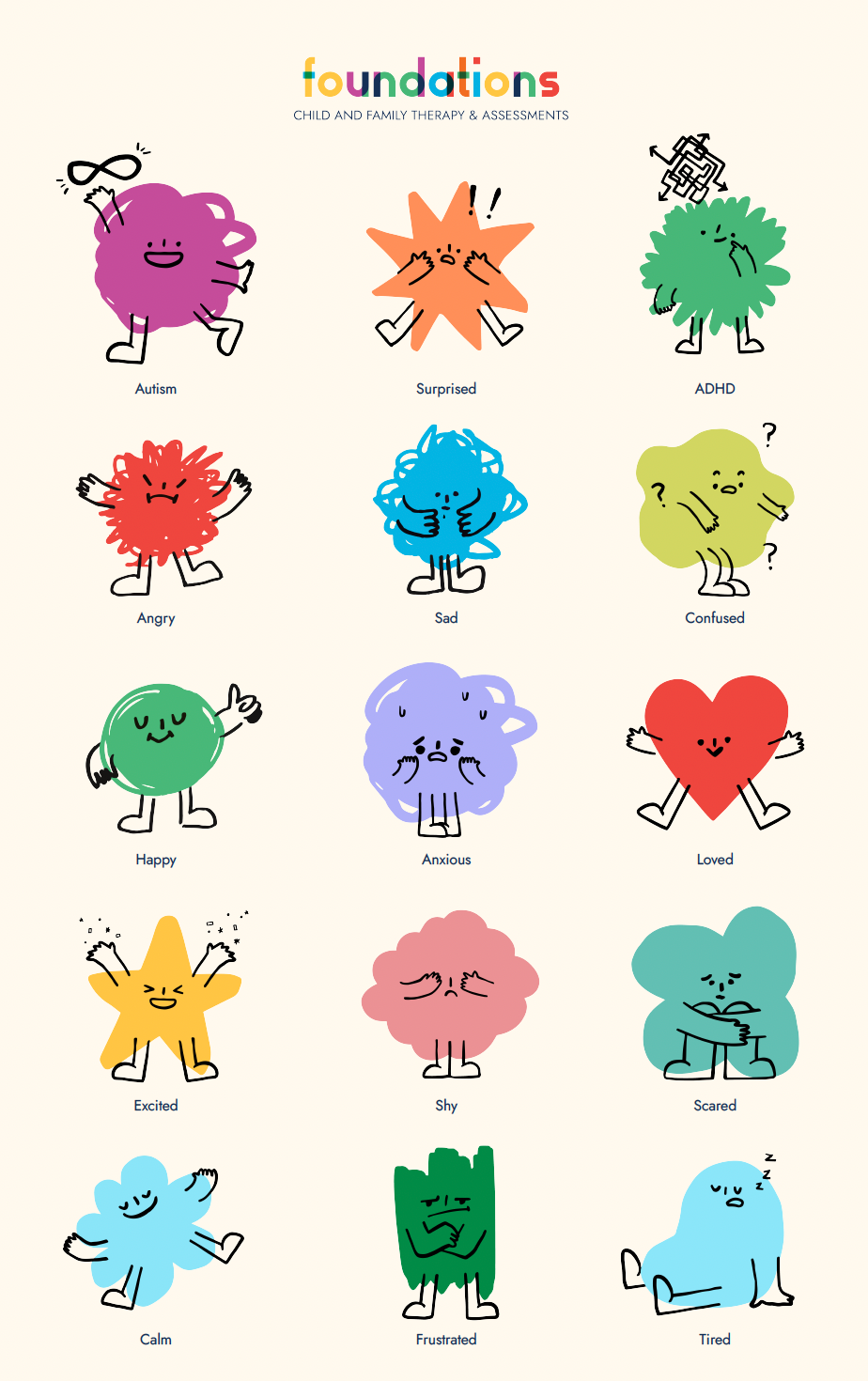
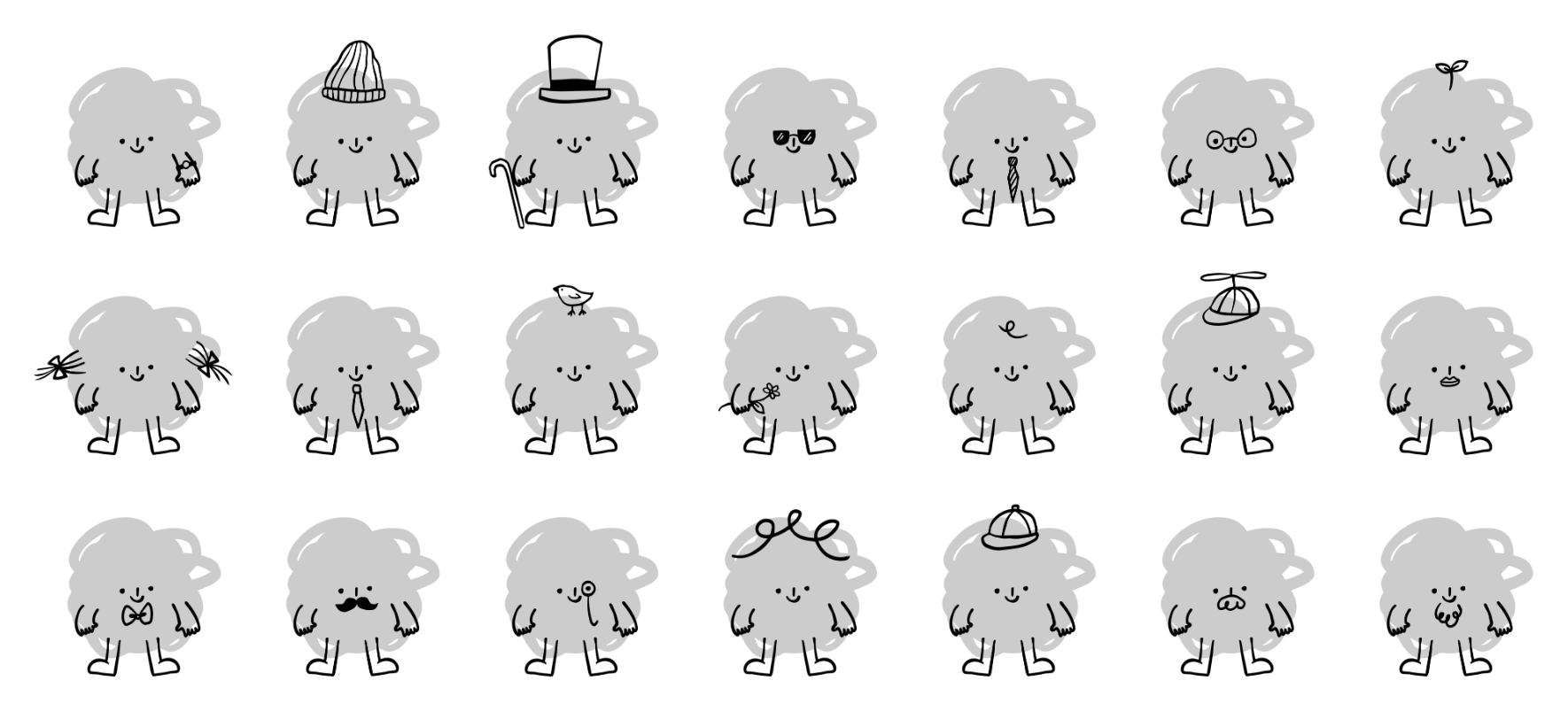
A set of characters was created to represent the key emotions children, adolescents, and families deal with. The characters were created in layers so they could be further customized like Lego pieces.