

Industry
Industrial Metals & Mining
Project
Branding
Sustainable Mineral Independence
LibertyStream is a Calgary-based lithium development and technology company working to unlock critical minerals from existing oil and gas infrastructure. Using their proprietary extraction technology, they recover lithium and other valuable minerals from oilfield brine — turning what was once a byproduct of fossil fuel extraction into a sustainable resource for the clean energy transition.
The Brief
As LibertyStream began scaling and stepping into investor conversations, they needed a brand identity that could carry the weight of their ambition. The ask was anything but ordinary. With operations in Texas and a technology rewriting the future of energy, they wanted a brand that represented the best of both worlds – the weathered trustworthiness of Americana and the precision of cutting-edge science.
The direction? Space cowboy. Timeless yet forward-thinking, rugged yet refined; a visual language that felt as at home on a ranch as it did in a boardroom.
My Role
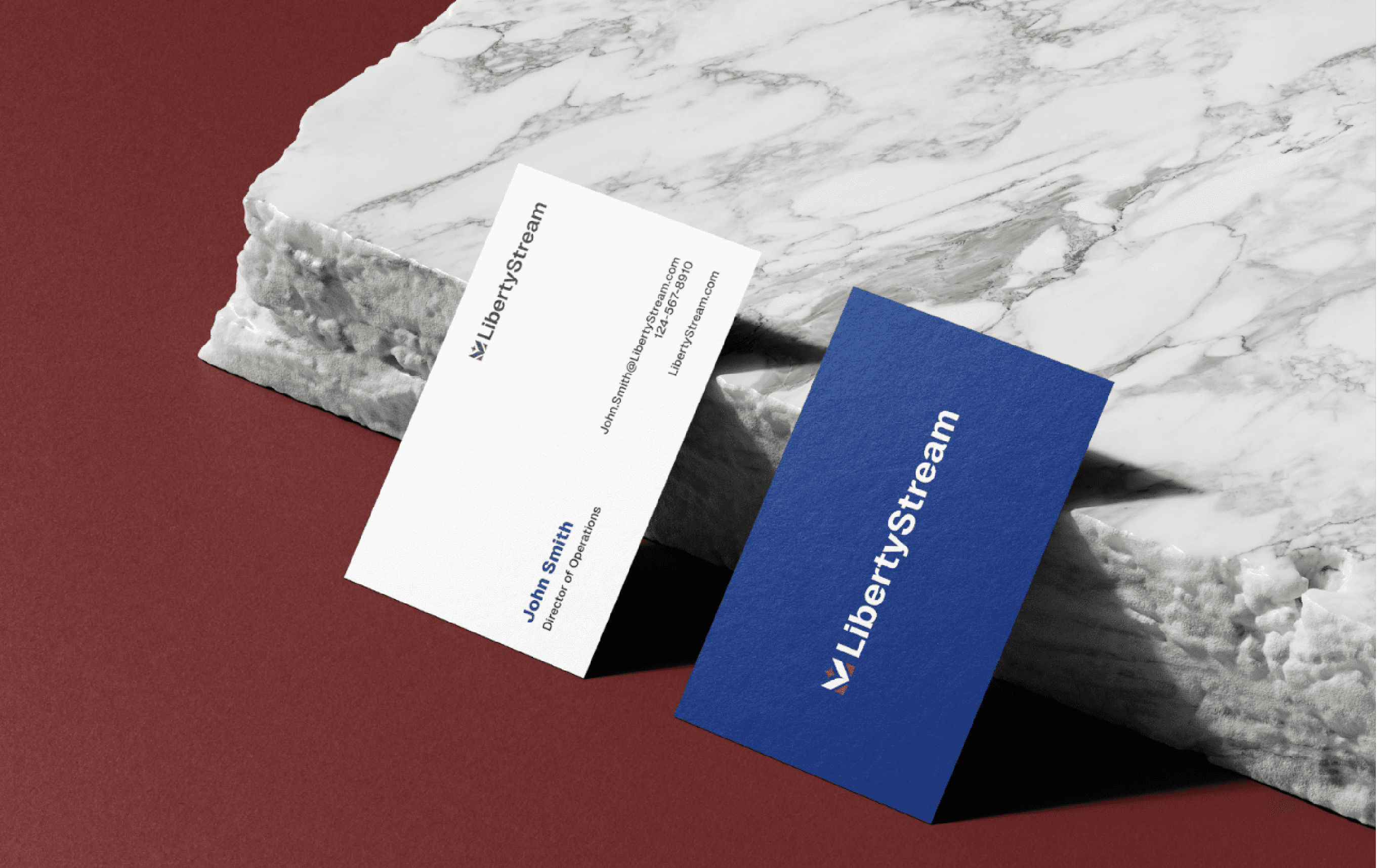
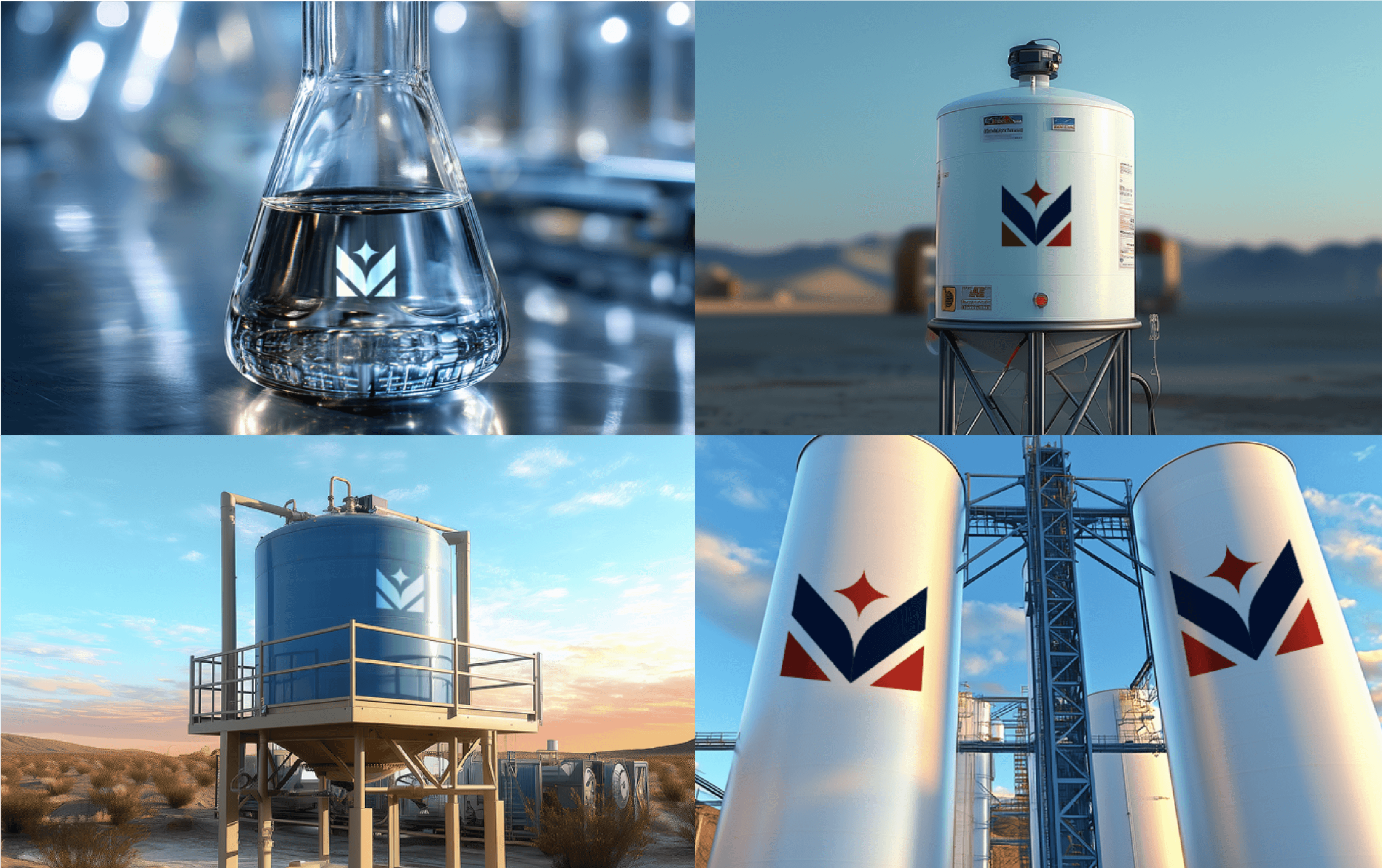
As the brand designer, I led the creation of the full brand identity system, which included logo, typography, colour palette, and art direction for imagery.
The central design challenge was threading the needle between several references: classic Americana, "space cowboy", and cutting-edge extraction technology. The logo draws on badge and star iconography, shapes with a deliberate tension between hard, angular edges and smooth curves, to evoke both frontier grit and something slightly otherworldly. The result feels grounded in American visual heritage without being too cliché.
The colour palette is unambiguously American, but chosen with intent. Deep, saturated hues anchor the identity and give the brand presence and weight, while warm, orange-toned photography — selected and art-directed to feel like Americana on Mars — creates a cinematic otherworldly frontier feel.
Typography is set in Geist: a typeface chosen for its clean, authoritative structure and its subtle nod to monospaced, vintage computing and the good old days.
The final system was developed in close collaboration with the project's web designer and project manager, ensuring the identity translated cohesively from brand to web.


Collaborators
Web Development Agency & Creative Direction: Bingo Bango Design